
A Summer, Explained with R
It’s 2:47pm, the meeting has been running for 38 minutes, and someone has just said, “Can everyone see my screen?”
You’re trying to concentrate, your laptop fan sounds like it’s preparing for take-off, and somewhere outside the temperature has climbed to 34°C. You’ve already relocated once today in search of a patch of shade under a tree with a half-decent breeze, laptop balanced on your knees, one eye on the battery icon. Meanwhile, your calendar still has three more meetings in it.
Summer 2026 has a funny way of making us notice things like this. It’s shaping up to be the UK’s warmest summer on record, with several heatwaves already behind us. Rather than spending another afternoon staring at a spreadsheet, why not give R something more interesting to do?
☀️ Let’s talk about the weather
This year, the UK weather hasn’t so much been unpredictable as relentlessly, record-breakingly hot. Which, if you’re a data person, is still a great excuse to explore.
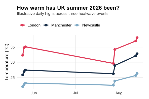
For example, imagine we have daily high temperatures for London, Manchester and Newcastle across this summer’s headline heatwaves. We could use R to quickly compare them, find the warmest days, and create a chart showing just how much hotter the south has been running than the north.
library(dplyr)

# Illustrative daily highs (°C) across three of this summer's heatwave events
summer_weather <- tribble(
  ~date,          ~city,        ~temperature,
  "2026-05-24",   "London",      32.3,
  "2026-05-24",   "Manchester",  25.8,
  "2026-05-24",   "Newcastle",   21.9,
  "2026-05-25",   "London",      34.8,
  "2026-05-25",   "Manchester",  26.9,
  "2026-05-25",   "Newcastle",   22.6,
  "2026-05-26",   "London",      35.1,
  "2026-05-26",   "Manchester",  27.4,
  "2026-05-26",   "Newcastle",   23.1,
  "2026-07-28",   "London",      29.6,
  "2026-07-28",   "Manchester",  26.2,
  "2026-07-28",   "Newcastle",   22.4,
  "2026-07-29",   "London",      34.2,
  "2026-07-29",   "Manchester",  28.9,
  "2026-07-29",   "Newcastle",   23.8,
  "2026-08-13",   "London",      37.0,
  "2026-08-13",   "Manchester",  32.1,
  "2026-08-13",   "Newcastle",   25.6,
  "2026-08-14",   "London",      38.1,
  "2026-08-14",   "Manchester",  32.8,
  "2026-08-14",   "Newcastle",   26.3
) |>
  mutate(date = as.Date(date))
library(ggplot2)

ggplot(summer_weather, aes(x = date, y = temperature, colour = city)) +
  geom_line() +
  geom_point() +
  labs(
    title = "How warm has UK summer 2026 been?",
    subtitle = "Daily highs across three of this summer's headline heatwaves",
    x = NULL,
    y = "Temperature (°C)"
  ) +
  theme_minimal()
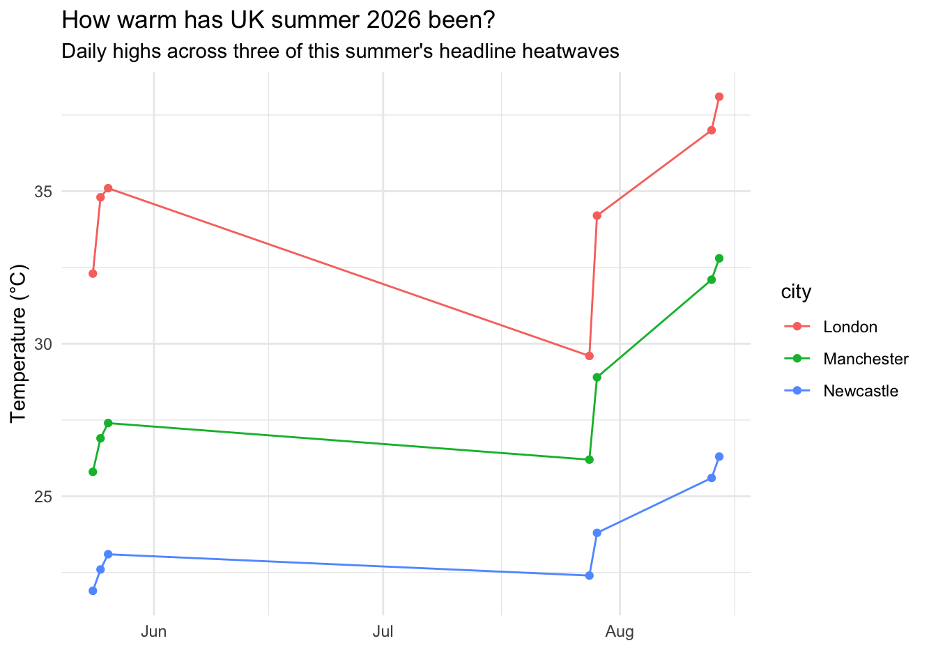
Suddenly, that spreadsheet of numbers becomes something you can actually explore. You can see, at a glance, just how much bigger the north-south gap gets once a heatwave really takes hold - London hit 38.1°C in mid-August while Newcastle stayed at 26.3°C on the same day.
And you don’t have to stop at temperature. You could look at rainfall (or the lack of it), reservoir levels, ice cream sales, train delays… or even investigate whether your team’s productivity mysteriously drops once the office hits 25°C.
🧠 A little summer upskilling
This is also where R becomes particularly useful.
Learning R isn’t just about knowing how to write code. It’s about becoming more comfortable taking a question, finding the right data, exploring it and turning the results into something that other people can understand.
Maybe you’ve been using R for a while but keep thinking, “There must be a better way to do this.”
There probably is.
Maybe you’re comfortable with the basics but want to get better at data visualisation, modelling, reproducible reporting or working with larger datasets.
That’s exactly where structured training can help.
At Jumping Rivers, we run practical training across R, Python, SQL, Quarto, Shiny and the wider Posit ecosystem. Our courses are designed around real-world work, so you can take what you learn straight back to your desk — preferably somewhere with a fan, or this year, maybe even air conditioning.
🍦 Make the summer count
The summer break can be a good time to step back from the usual routine and invest in skills that make the rest of the year easier.
You could spend a few hours learning a better way to manipulate data, finally get to grips with ggplot2, explore Quarto, or start building your first Shiny application.
And if you’re not sure what training would actually be useful for you or your team, that’s where we can help too.
We can look at the tools you’re currently using, the skills your team already has and where the gaps are, then recommend a training path that makes sense.
No complicated spreadsheets required.
Although, if you do have one - perhaps tracking this summer’s heatwaves - we’re always happy to help you turn it into something much more interesting.
☀️ Ready to make your next data project a little more enjoyable?
Explore our public training courses or get in touch with the Jumping Rivers team to talk about what would work best for you.