Animated Maps with {ggplot2} and {gganimate}
In this blog post, we are going to use data from the {gapminder} R package, along with global spatial boundaries from ‘opendatasoft’. We are going to plot the life expectancy of each country in the Americas and animate it to see the changes from 1957 to 2007.
The {gapminder} package we are using is from the Gapminder foundation, an independent educational non-profit fighting global misconceptions. The cover issues like global warming, plastic in the oceans and life satisfaction.
First we will load the full dataset from the gapminder package, and see what is contained within it.
data("gapminder_unfiltered", package = "gapminder")
names(gapminder_unfiltered)
## [1] "country" "continent" "year" "lifeExp" "pop" "gdpPercap"
Then we will filter the dataset to keep life expectancy data for the years from 1952 to 2007 (in 5-year steps).
A shapefile (*.shp) containing the geographical boundaries of each
country can be imported using the {sf} R package.
library(sf)
library(dplyr)
if (getwd() == "/home/osheen/corporate-website"){
  world = st_read("content/blog/2025-animated-map/data/world-administrative-boundaries.shp") |>
    select(-"continent")
} else {
  world = st_read("data/world-administrative-boundaries.shp") |>
    select(-"continent")

}
## Reading layer `world-administrative-boundaries' from data source
##   `/home/osheen/corporate-website/content/blog/2025-animated-map/data/world-administrative-boundaries.shp'
##   using driver `ESRI Shapefile'
## Simple feature collection with 256 features and 8 fields
## Geometry type: MULTIPOLYGON
## Dimension:     XY
## Bounding box:  xmin: -180 ymin: -58.49861 xmax: 180 ymax: 83.6236
## Geodetic CRS:  WGS 84
head(world)
## Simple feature collection with 6 features and 7 fields
## Geometry type: MULTIPOLYGON
## Dimension:     XY
## Bounding box:  xmin: -58.43861 ymin: -34.94382 xmax: 148.8519 ymax: 51.09111
## Geodetic CRS:  WGS 84
##   iso3                          status color_code                     name
## 1  MNP                    US Territory        USA Northern Mariana Islands
## 2 <NA>           Sovereignty unsettled        RUS            Kuril Islands
## 3  FRA                    Member State        FRA                   France
## 4  SRB                    Member State        SRB                   Serbia
## 5  URY                    Member State        URY                  Uruguay
## 6  GUM US Non-Self-Governing Territory        GUM                     Guam
##            region iso_3166_1_              french_shor
## 1      Micronesia          MP Northern Mariana Islands
## 2    Eastern Asia        <NA>            Kuril Islands
## 3  Western Europe          FR                   France
## 4 Southern Europe          RS                   Serbie
## 5   South America          UY                  Uruguay
## 6      Micronesia          GU                     Guam
##                         geometry
## 1 MULTIPOLYGON (((145.6333 14...
## 2 MULTIPOLYGON (((146.6827 43...
## 3 MULTIPOLYGON (((9.4475 42.6...
## 4 MULTIPOLYGON (((20.26102 46...
## 5 MULTIPOLYGON (((-53.3743 -3...
## 6 MULTIPOLYGON (((144.7094 13...
One of the nice things about the {sf} package is that it stores
geographical data in a specialised data-frame structure which allows us
to merge our boundary data with the gapminder statistics using the same
functions that we would use to combine more typical data-frames. Here we
join the two datasets, matching the entries by country name, using the
dplyr left_join function.
joined = left_join(gapminder_unfiltered,
                   world,
                   by = c("country" = "name")) |>
  st_as_sf()
head(joined)
## Simple feature collection with 6 features and 12 fields
## Geometry type: MULTIPOLYGON
## Dimension:     XY
## Bounding box:  xmin: 60.50417 ymin: 29.40611 xmax: 74.91574 ymax: 38.47198
## Geodetic CRS:  WGS 84
## # A tibble: 6 × 13
##   country     continent  year lifeExp      pop gdpPercap iso3  status color_code
##   <chr>       <fct>     <int>   <dbl>    <int>     <dbl> <chr> <chr>  <chr>
## 1 Afghanistan Asia       1952    28.8  8425333      779. AFG   Membe… AFG
## 2 Afghanistan Asia       1957    30.3  9240934      821. AFG   Membe… AFG
## 3 Afghanistan Asia       1962    32.0 10267083      853. AFG   Membe… AFG
## 4 Afghanistan Asia       1967    34.0 11537966      836. AFG   Membe… AFG
## 5 Afghanistan Asia       1972    36.1 13079460      740. AFG   Membe… AFG
## 6 Afghanistan Asia       1977    38.4 14880372      786. AFG   Membe… AFG
## # ℹ 4 more variables: region <chr>, iso_3166_1_ <chr>, french_shor <chr>,
## #   geometry <MULTIPOLYGON [°]>
I am going to select the country column and plot that using the base R
plot function for a quick visualisation.
joined |>
  select("country") |>
  plot()
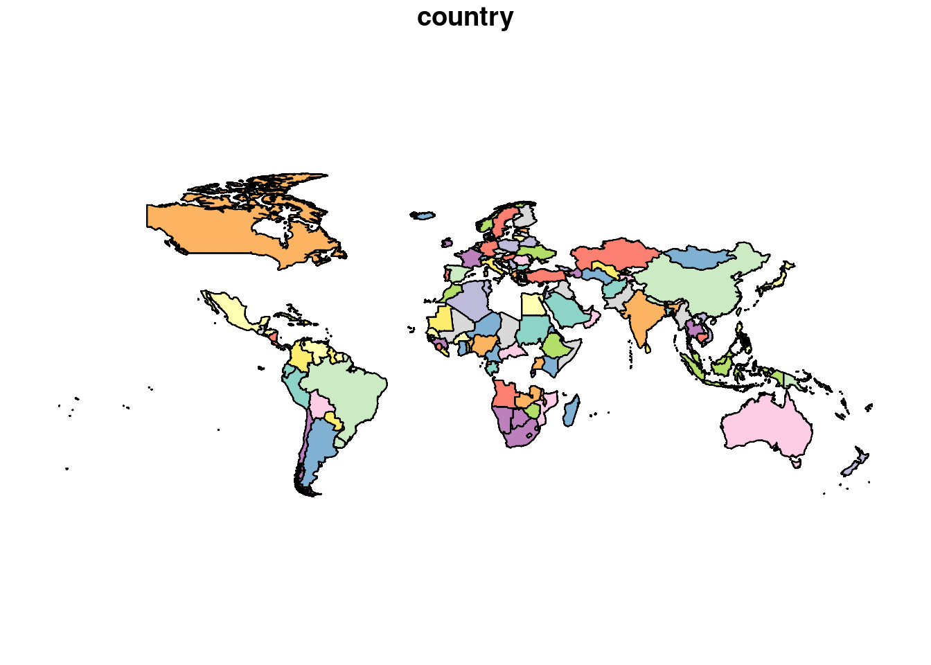
Hmmmmmmm that doesn’t look quite right does it?
The issue here is a common one when grabbing a spatial boundaries file
from the internet. The data sets being joined have different names for
some of the countries. For example, in the world data we have USA as
‘United States’ where as in gapminder it’s ‘United States of America’.
The dplyr::anti_join function can be helpful finding countries that
don’t match. I will use fct_recode from {forcats} to align the world
country names with gapminder. In the example below, I am just fixing
the USA but you can see from the plot above that several other countries
need to be recoded (19 in total), I am doing this behind the scenes to
avoid clogging up the page.
library(forcats)
world = world |>
  mutate(name = fct_recode(.data$name,
                           "United States" =
                             "United States of America"))
Okay, lets see what this looks like now.
joined |>
  select("country") |>
  plot()

That’s better! Now I’ve got the data I want to plot, I can use ggplot2
to start creating the visualisation that I will be animating. Before
that, I will filter the data to keep only the Americas, then use
geom_sf to plot the geometry data.
library(ggplot2)

americas = joined |>
  filter(continent == "Americas")

americas_plot = ggplot(americas) +
  geom_sf()
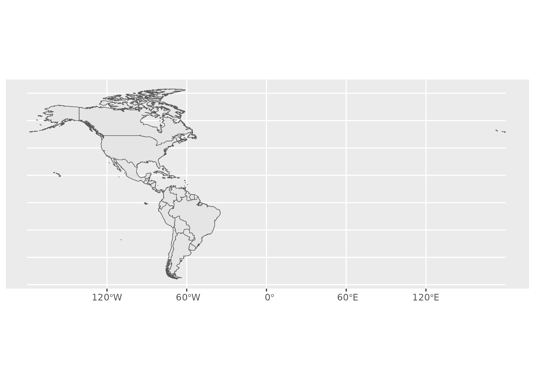
This plot looks good but I’m going to change the coordinate reference
system (CRS) to one (“EPSG:8858”) that is designed for the Americas. I
found this CRS on epsg.io, a website I would
recommend if you are looking for some different CRS’s. st_transform
can be used to change the CRS to EPSG:8858. This is what it looks like
now:
americas = st_transform(americas, "EPSG:8858")

new_crs_plot = ggplot(americas) +
  geom_sf()
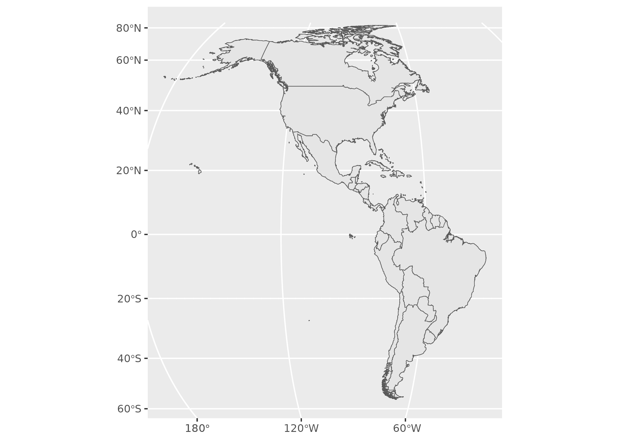
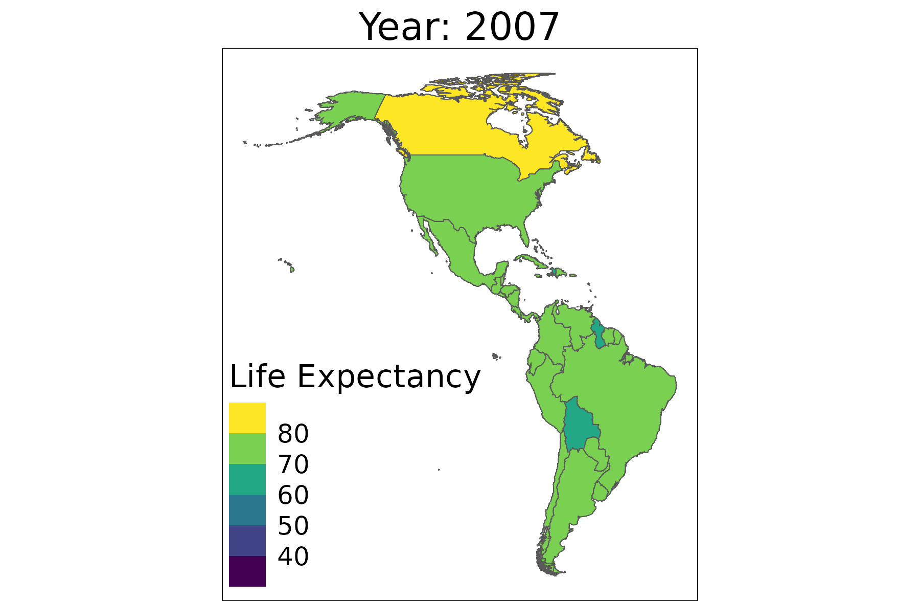
Okay so now the plot looks right we will start preparing it to be animated.
library(ggplot2)

plot = americas %>%
  filter(year == 2007) %>%
  ggplot() +
  geom_sf(aes(fill = lifeExp)) +
  labs(title = "Year: 2007",
       fill = "Life Expectancy") +
  theme_void() +
  ggplot2::scale_fill_viridis_b() +
  theme(legend.position = c("inside"),
        legend.position.inside = c(0.23, 0.23),
        plot.title = element_text(size = 15,
                                  hjust = 0.5),
        panel.border = element_rect(color = "black",
                                    fill = NA))
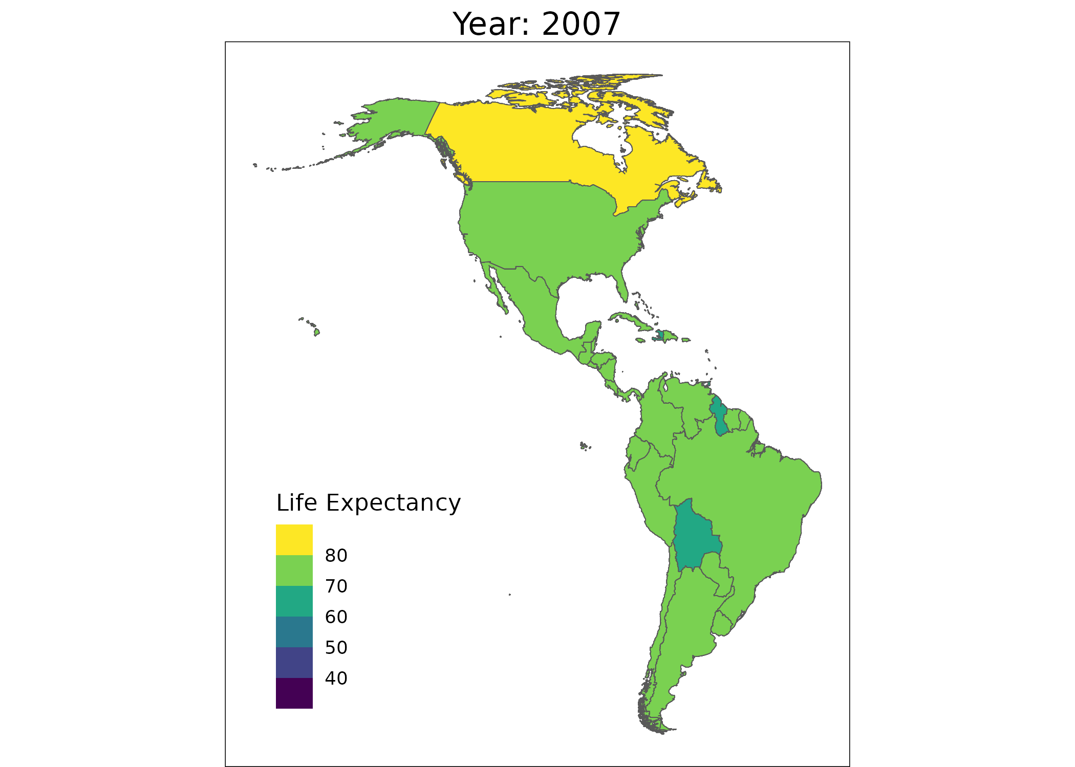
This is the plot we are going to animate now so we’ll use {gganimate}.
The transition_states function partitions the data using a states
column (here our ‘year’ column), iteratively creating a frame of the
animation for each year value in the input data. The next function is
animate which will convert these frames into a GIF. Note, make sure
you have the dependencies installed or you may end up with 100 PNG files
in your working directory rather than a GIF!
library(gganimate)

animation = plot +
  ggtitle("Year: {closest_state}") +
  transition_states(states = year)

animate(animation,
        renderer = gifski_renderer("img/map.gif"),
        alt = "Animation with missing values.")
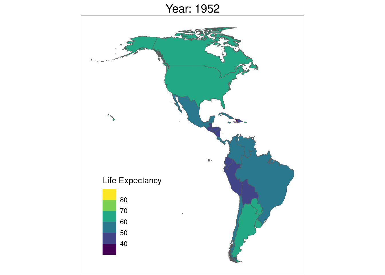
The keener eyed of you will notice some countries don’t have a value for every year.
americas |>
  st_drop_geometry() |>
  count(country) |>
  arrange(n)
## # A tibble: 36 × 2
##    country                  n
##    <chr>                <int>
##  1 French Guiana            1
##  2 Guadeloupe               1
##  3 Martinique               1
##  4 Aruba                    8
##  5 Grenada                  8
##  6 Netherlands Antilles     8
##  7 Suriname                 8
##  8 Bahamas                 10
##  9 Barbados                10
## 10 Belize                  10
## # ℹ 26 more rows
So 25 countries have 12 observations (the max), four have 10 and 8 respectively and three have 1. To fill in these blanks, I’m going to use {tidyr} to compute some mock values using the dataset mean for each year. The countries with one would continue with one value from from 2002.
library(tidyr)

completed = americas |>
  mutate(country = forcats::fct_drop(country)) |>
  complete(year, country) |>
  select(country, lifeExp, year) |>
  group_by(year) |>
  mutate(lifeExp =
           replace_na(lifeExp,
                      replace = mean(lifeExp,
                                     na.rm = TRUE)))

geoms = americas |>
  select(country) |>
  distinct()

plot = left_join(completed,
                 geoms,
                 by = "country") |>
  st_as_sf() |>
  st_transform("EPSG:8858") |>
  ggplot() +
  geom_sf(aes(fill = lifeExp)) +
  labs(title = "Year: {closest_state}",
       fill = "Life Expectancy") +
  theme_void() +
  ggplot2::scale_fill_viridis_b() +
  theme(legend.position = c("inside"),
        legend.position.inside = c(0.23, 0.23),
        plot.title = element_text(size = 15,
                                  hjust = 0.5),
        panel.border = element_rect(color = "black",
                                    fill = NA))
animation = plot +
  transition_states(states = year)

animate(animation,
        renderer = gifski_renderer("img/map2.gif"))

So that is our final animated map, of course we could add more styling or complexity - maybe in a future blog. If you want to learn more about working the topic, check out our Spatial Data Analysis with R course or another Jumping Rivers blog, Thinking About Maps and Ice Cream by Nicola Rennie.