Using {ellmer} for Dynamic Alt Text Generation in {shiny} Apps
Alt Text
First things first, if you haven’t heard of or used alt text before, it is a brief written description of an image that explains context and purpose. It is used to improve accessibility by allowing screen readers to describe images, or provide context if an image fails to load. For writing good alt text see this article by Havard, but some good rules of thumb are:
- Keep it concise and relevant to the context of why the image is being used.
- Screen reader will already say “Image of …” so we don’t need to include this unless the style is important (drawing, cartoon etc).
Alt Text within Apps and Dashboards
I don’t need to list the positives of interactive apps and dashboards, however one of the main ones is interactivity and allowing users to explore data in their own way. This is a great thing most of the time, but one pitfall that is often overlooked is interactivity can overshadow accessibility. Whether it’s a fancy widget that’s hard (or impossible) to use via keyboard or interactive visualisations without meaningful alternative text.
In this post, we’ll look at a new approach to generating dynamic alt text for ggplot2 charts using {ellmer}, Posit’s new R package for querying large language models (LLM) from R. If you are using Shiny for Python then chatlas will be of interest to you.
Why Dynamic Alt Text Needs Care
Automatically generating alt text is appealing, but production Shiny apps have constraints:
- Plots may re-render frequently
- API calls can fail or be rate-limited
- Accessibility should degrade gracefully, not break the app
- A good implementation should be consistent, fault-tolerant, and cheap to run.
Using {ellmer} in a Shiny App
The first step is setting up a connection to your chosen LLM, I am using Google Gemini Flash-2.5 as there is a generous free tier but other model and providers are available. In a Shiny app, this can done outside the reactive context:
library(ellmer)
gemini <- chat_google_gemini()
## Using model = "gemini-2.5-flash".
Note: You should have a Google Gemini key saved in you .Renviron file as
GEMINI_API_KEY, this way the {ellmer} function will be able to find
it. More information on generating a Gemini API key can be found, in the
Gemini docs.
Then we have the function for generating the alt text:
library(ggplot2)

generate_alt_text = function(ggplot_obj, model) {
  temp <- tempfile(fileext = ".png")
  on.exit(unlink(temp))

  ggsave(
    temp,
    ggplot_obj,
    width = 6,
    height = 4,
    dpi = 150
  )

  tryCatch(
    model$chat(
      "
Generate concise alt text for this plot image.
Describe the chart type, variables shown,
key patterns or trends, and value ranges where visible.
      ",
      content_image_file(temp)
    ),
    error = function(e) {
      "Data visualisation showing trends and comparisons."
    }
  )
}
The function has a few features that will keep the output more reliable:
Consistent image size and resolution - helps model reliability when reading axes and labels.
Explicit cleanup of temporary files - we don’t need to save the images once text is generated.
Error handling - if the model call fails, the app still returns usable alt text. We kept our fallback text simple for demonstration purposes, but you can attempt to add more detail.
External model initialisation - only created once and passed in, rather than re-created on every reactive update.
Examples
In this section will just create a few example plots then see what the LLM generates.
simple_plot = ggplot(iris) +
  aes(Sepal.Width, Sepal.Length) +
  geom_point()
simple_plot

simple_plot_alt = generate_alt_text(simple_plot, gemini)
paste("Alt text generated by AI: ", simple_plot_alt)
Alt text generated by AI:
Scatter plot showing Sepal.Length on the y-axis (ranging from approximately 4.5 to 8.0) versus Sepal.Width on the x-axis (ranging from approximately 2.0 to 4.5). The data points appear to form two distinct clusters: one with Sepal.Width between 2.0 and 3.0 and Sepal.Length between 5.0 and 8.0, and another with Sepal.Width between 3.0 and 4.5 and Sepal.Length between 4.5 and 6.5.
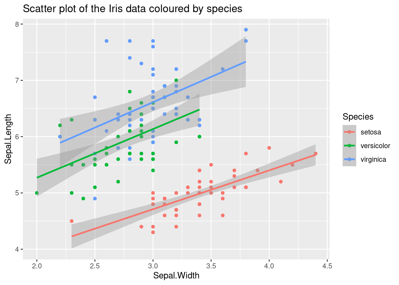
plot = ggplot(iris) +
  aes(Sepal.Width, Sepal.Length, colour = Species) +
  geom_point()
plot

plot_alt =
  generate_alt_text(plot, gemini)
paste("Alt text generated by AI: ", plot_alt)
Alt text generated by AI:
Scatter plot showing Sepal.Length on the y-axis (range 4.5-8.0) versus Sepal.Width on the x-axis (range 2.0-4.5), with points colored by Species. Red points, labeled “setosa”, form a distinct cluster with higher Sepal.Width (3.0-4.5) and lower Sepal.Length (4.5-5.8). Blue points, “virginica”, tend to have higher Sepal.Length (5.5-8.0) and moderate Sepal.Width (2.5-3.8). Green points, “versicolor”, are in between, with moderate Sepal.Length (5.0-7.0) and Sepal.Width (2.0-3.5), overlapping with virginica.
complicated_plot = ggplot(iris) +
  aes(Sepal.Width, Sepal.Length, colour = Species) +
  geom_point() +
  geom_smooth(method = "lm")
complicated_plot

complicated_plot_alt =
  generate_alt_text(complicated_plot, gemini)
paste("Alt text generated by AI: ", complicated_plot_alt)
Alt text generated by AI:
Scatter plot showing Sepal.Length on the y-axis (range 4.0-8.0) versus Sepal.Width on the x-axis (range 2.0-4.5). Points and linear regression lines are colored by Iris species. Red points, “setosa”, cluster with lower Sepal.Length (4.0-5.8) and higher Sepal.Width (2.8-4.4). Green points, “versicolor”, and blue points, “virginica”, largely overlap, showing higher Sepal.Length (5.0-8.0) and moderate Sepal.Width (2.0-3.8), with “virginica” generally having the longest sepals. All three species exhibit a positive linear correlation, indicated by their respective regression lines and shaded confidence intervals, where increasing sepal width corresponds to increasing sepal length.
As we can see the alt text can be very good and informative when using LLMs. One alternative that I want to point out is actually including a summary of the data behind the plot. This way screen reader users can still gain insight from the plot.
Using Dynamic Alt Text in Shiny
Once generated, the alt text can be supplied directly to the UI:
- Via the
altargument ofplotOutput() - Or injected into custom HTML for more complex layouts
Because the text is generated from the rendered plot, it stays in sync with user inputs and filters.
Other Considerations
Some apps may be more complicated and/or have a high number of users. These type of apps will need a bit more consideration to include features like this:
- Caching alt text for unchanged plots to reduce API usage
- Prompt augmentation with known variable names or units
- Manual overrides for critical visuals
Conclusion
AI-generated alt text works best as a supporting tool, not a replacement for accessibility review. I have also found it helpful to let users know that the alt text is AI generated so they know to take it with a pinch of salt.
Dynamic alt text is a small feature with a big impact on inclusion. By combining Shiny’s reactivity with consistent rendering, error handling, and modern LLMs, we can make interactive data apps more accessible by default whilst not increasing developer burden.