Sparklines in Reactable Tables
This is the second blog in a series about the {sparkline} R package for inline data visualisations. You can read the first one here. In this post I will be demonstrating how you can include sparklines inside HTML tables.
Reactable
{reactable} is an R package for producing HTML tables, commonly used in Shiny.
To create a HTML reactable table
all we need to do is input a data.frame object to the reactable
function. These tables have a nice simple default look however we can
also add our own styles very easily. In our first example of a table I
am just using the in built R iris dataset.
library(reactable)

reactable(iris)
A few things that can be easily added to reactable tables are filters, sortable columns, searchable columns, default page size, borders and striped & text wrapping. Along with these arguments we can of course implement our own styling with CSS.
reactable(
  iris,
  striped = TRUE, searchable = TRUE,
  filterable = TRUE, bordered = TRUE,
  defaultPageSize = 8
)
Sparklines in Reactable Tables
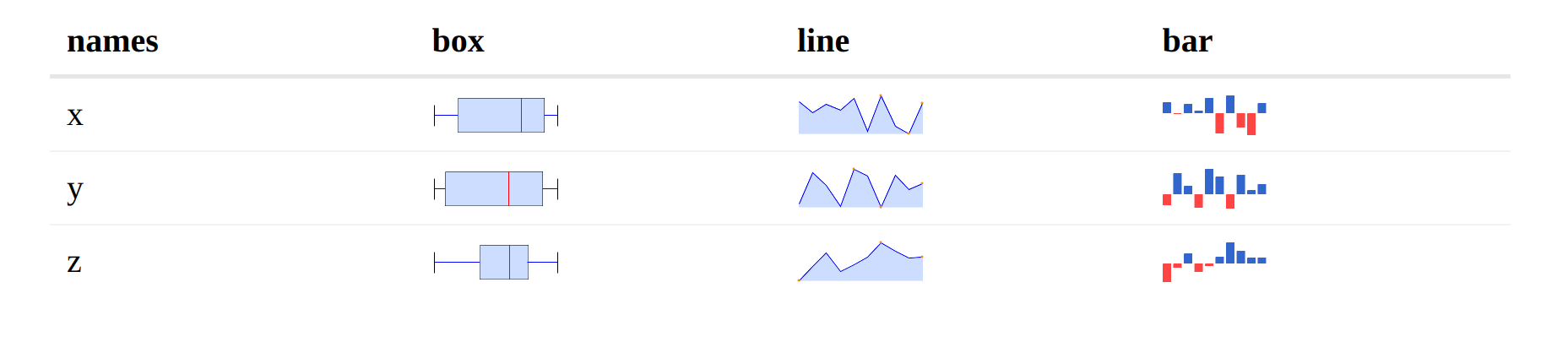
Box, Line and Bar Charts
When it comes to embedding sparklines in reactable tables we need to add
a new column to our table, which we will then overwrite in the columns
argument of reactable.
In the first example I am using a mock dataset with 3 observations ‘x’,
‘y’ and ‘z’, each one is just a list containing 10 values generated by
rnorm. Then I am using dplyr’s mutate function to add a column full
of NA values.
Now on the reactable side, I am again using the reactable function,
where I use the columns argument which takes a “Named list of column
definitions”. For each different sparkline I will need to use colDef
to add a function which takes a value and index argument. I then use the
sparkline function and pass data$values[[index]] along with the type
to determine which chart I’d like. You can set a column preferences in
colDef, I have used it here to hide the values column.
library(sparkline)
library(dplyr)

data = tibble(
  names = c("x", "y", "z"),
  values = c(list(rnorm(10)), list(rnorm(10)), list(rnorm(10)))
  ) |>
  mutate(box = NA,
         line = NA,
         bar = NA)

table = reactable(data,
          columns = list(
            values = colDef(show = FALSE),
            box = colDef(cell = function(value, index) {
              sparkline(data$values[[index]], type = "box")
            }),
            line = colDef(cell = function(value, index) {
              sparkline(data$values[[index]], type = "line")
            }),
            bar = colDef(cell = function(value, index) {
              sparkline(data$values[[index]], type = "bar")
            })
          )
        )
Bullet Chart
In our final example, I am again using the iris data but this time I’m
creating a summary for each species containing the mean and
inter-quartile range (IQR) of the Sepal.Length column. These values will
be used to create a bullet
graph.
In a bullet graph, an observed value (the ‘performance’) is compared
against a target value, and an illustration of the data-spread (here the
IQR) are presented. In a given row of the figure, the value of
Sepal.Width for a specific iris will be presented as the performance;
the target that this is compared against is the mean for the relevant
species, lower IQR will be the range1 and higher IQR will be range2.
Then when creating our reactable table it is slightly different to our
previous example (where I just pass a list of values to the sparkline
function), for a bullet graph I will need to pass in a vector in the
form c(target, performance, range1, range2). I can then access the
values via d$ (or another form of extraction) and specify which row I
need with [[index]].
d = iris |>
  group_by(.data$Species) |>
  mutate(mean = mean(.data$Sepal.Length),
         lower_range = range(.data$Sepal.Length)[1],
         upper_range = range(.data$Sepal.Length)[2],
         bullet = NA)

iris_table = reactable(d, defaultColDef = colDef(show = FALSE),
          columns = list(
            Species = colDef(show = TRUE),
            Sepal.Length = colDef(show = TRUE),
            bullet = colDef(cell = function(value, index) {
              sparkline(c(d$mean[[index]],
                          d$Sepal.Length[[index]],
                          d$upper_range[[index]],
                          d$lower_range[[index]]), type = "bullet")
            }, show = TRUE)
          ))
In this blog we have implemented box-plots, bar, line and bullet graphs into reactable tables. Other options can be found on the jQuery Sparklines website or in the previous blog. Stay tuned for the next blog in this series on using sparkline reactable tables in Shiny apps.