Choosing which colours to use in a plot is an important design decision. A good choice of colour palette can highlight important aspects of your data, but a poor choice can make it impossible to interpret correctly. There are numerous colour palette R packages out there that are already compatible with {ggplot2}. For example, the {RColorBrewer} or {viridis} packages are both widely used. If you regularly make plots at work, it’s great to have them be consistent with your company’s branding.
ggplot2
Last week I spent some time reminiscing about my PhD and looking through some old R code. This trip down memory lane led to some of my old R scripts that amazingly still run. My R scripts were fairly simple and just created a few graphs. However now that I’ve been programming in R for a while, with hindsight (and also things have changed), my original R code could be improved.
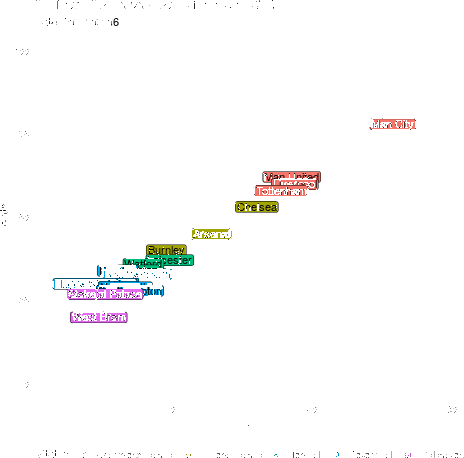
Ever wonder what an evolving gif of each premier league team’s goal difference vs points would look like made in R? Look no further! Most of this is going to be setting up the data (as always) instead of actually plotting the data. To get the data into shape, we’re going to be using the {tidyverse} and {lubridate}, which you can install the usual way via install.packages(). To animate the data we’ll be using the {gganimate} package.
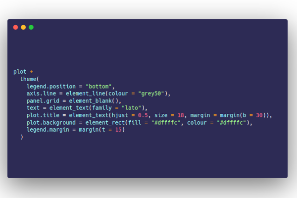
Styling {ggplot2} graphics In our previous post, we demonstrated that contrary to popular opinion, it is possible to generate attractive looking plots using just base graphics. Although we did confess, that it did take a lot of time and effort. In this post, we repeat the same exercise. Using the dreaded iris data set, we’ll first create the default {ggplot2} graph, before applying a bit of care and attention. The standard ggplot version The standard scatter plot is straightforward to create.
Published: February 1, 2018
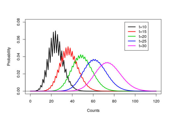
Hi all, so given our logo here at Jumping Rivers is a set of lines designed to look like a Gaussian Process, we thought it would be a neat idea to recreate this image in R. To do so we’re going to need a couple packages. We do the usual install.packages() dance (remember this step can be performed in parallel). install.packages(c("ggplot2", "ggalt", "readr")) Do you use Professional Posit Products?
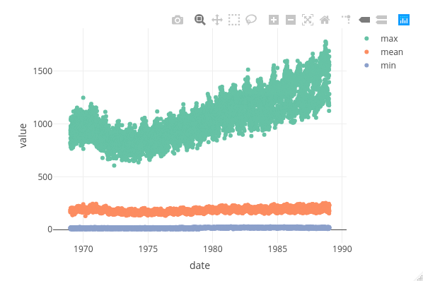
The {plotly} package. A godsend for interactive documents, dashboard and presentations. For such documents, there is no doubt that anyone would prefer a plot created in {plotly} rather than {ggplot2}. Why? Using {plotly} gives you neat and crucially interactive options at the top, whereas {ggplot2} objects are static. In an app we have been developing here at Jumping Rivers, we found ourselves asking the question would it be quicker to use plot_ly() or wrapping a {ggplot2} object in ggplotly()?
Recent Posts
- Shiny in Production: Sponsors
- Reproducible reports with Jupyter
- posit::conf(2023)
- Shiny in Production: Full speaker lineup
- Using Stan to analyse global UFO sighting reports
- Talks to watch at the RSS International Conference 2023
- Our ISO 27001 Certification
- Best Practices for Data Cleaning and Preprocessing
- SatRdays London 2023 - Recordings
- Generate multiple presentations with Quarto parameters