Online R and Python Training Courses: 2026 Schedule
Published: May 1, 2026.
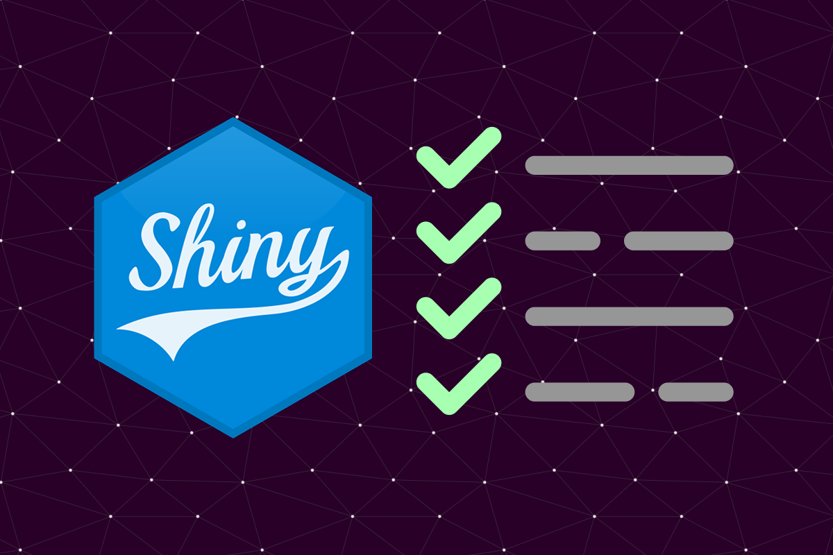
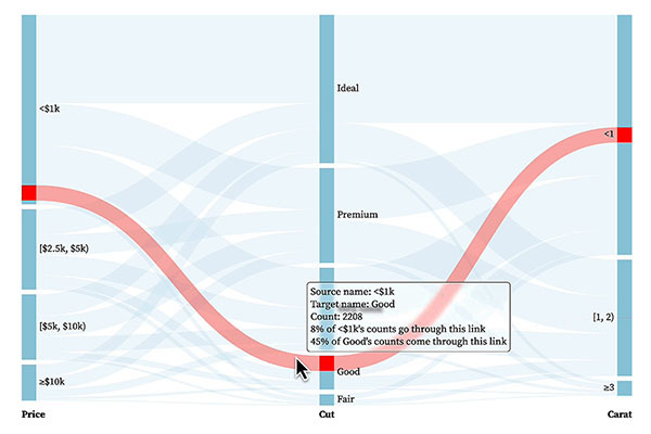
A full schedule of online data science training courses is now available through to November 2026, covering R, Python, machine learning, statistical modelling, Shiny, and more. All sessions run online over six hours.